Design Systems
My professional journey encompasses the development of design systems within two distinct organizational environments, Via and One Zero. Each experience offered unique challenges and learnings, significantly contributing to the digital products and teams involved.
Year
2021-24
Tools
Figma
Team
Product designer (me), Dev teams
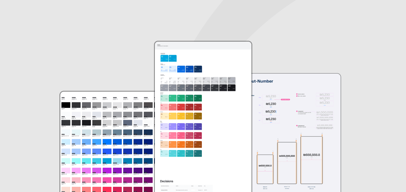

Via - Gaining Experience
At Via, our mobile design team requested to start a project of redesigning the Rider app, the product that serves the majority of users across all products in company. During working on this project I requested to create a design system ensuring a cohesive visual and functional user experience. A foundational design direction had been established by the design lead, upon which I was tasked to expand and refine.
I wasn’t very familiar with Figma at the time, which was our primary tool. coming from Sketch required a learning curve, yet it was an opportunity for me to level up my skills and to learn more. I began by exploring leading design systems in the industry to learn strategics and best practices.
The process of building the design system was taking several months while working on the redesign itself and on flows within it.
The results claimed great responses by the app’s dev and design teams, made delivering and building much easier and effectively.


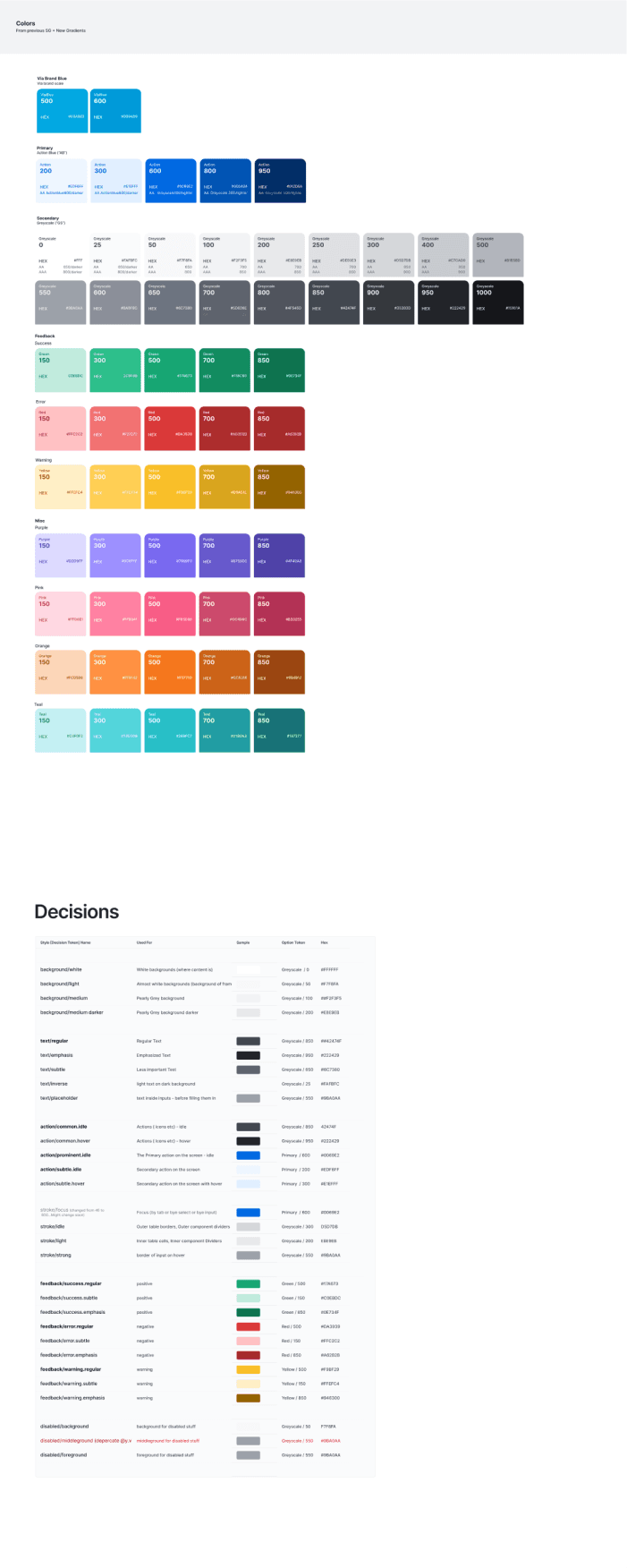
01 Colors & texts - VIA DS
01 Colors & texts - VIA DS
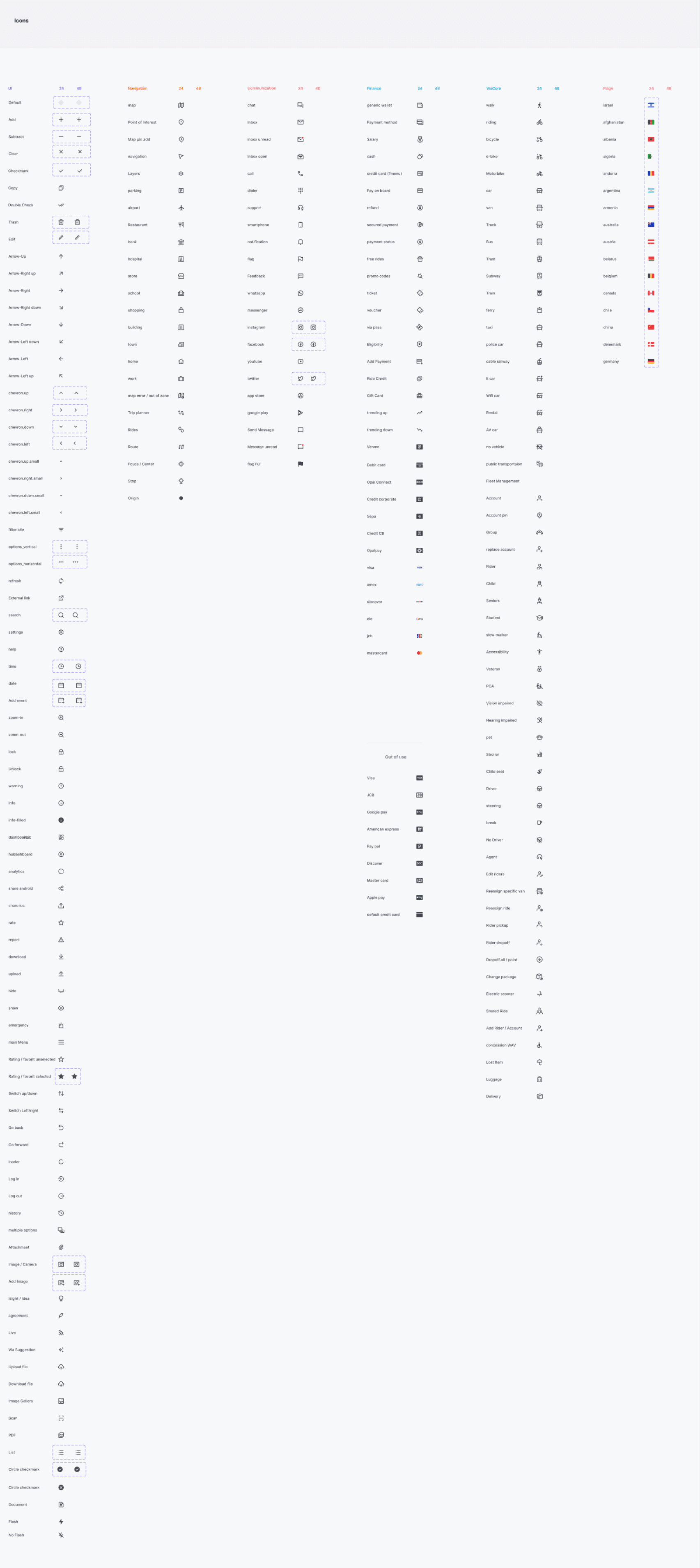


02 Icons - VIA DS
02 Icons - VIA DS
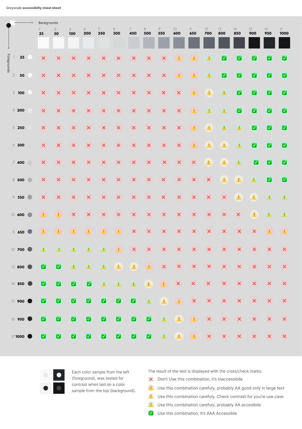


03 Accesability Guidelines - VIA DS
03 Accesability Guidelines - VIA DS
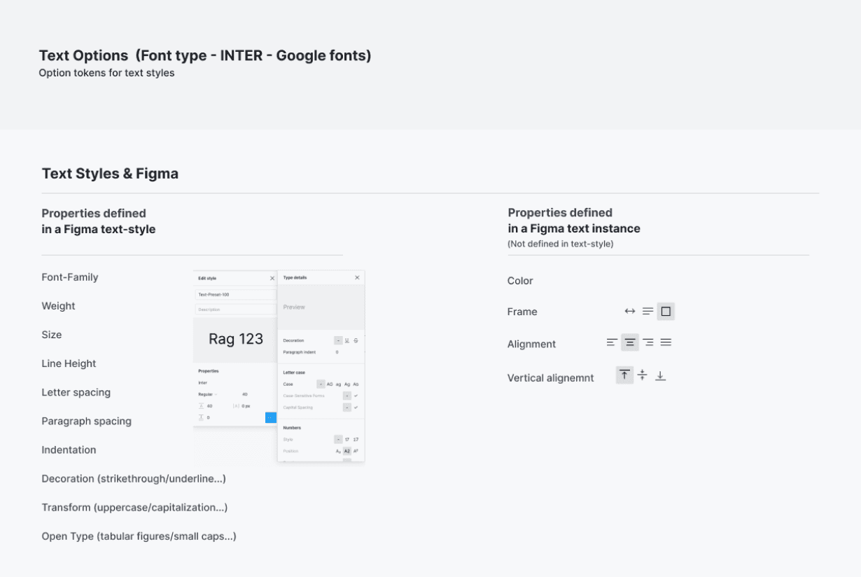


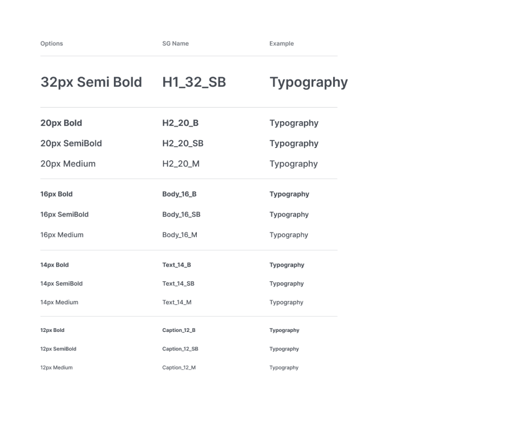


04 Typography - VIA DS
04 Typography - VIA DS
05 Components - VIA DS
05 Components - VIA DS
One Zero - New Challenges
When moved to work at One Zero, and after the experience I gained in building a large design system at Via, the company faced a challenge where there was a significant need to build a well-structured design system. Unlike Via, at One Zero, the design team worked with Sketch (the entire app was built in Hebrew and targeted the Israeli audience only, and at that time, Hebrew support just got to Figma). The company saw a move to Figma as an opportunity to building a design system.
I was chosen to take ownership of creating the design system in Figma and to lead the teams for this transitions.
The work was challenging and required high technical skills, but I handled it well. The building situation here was a bit different, since there were already complete designs and screens built in Sketch. The task began with identifying and pulling the repeating components to build components and foundations around it.
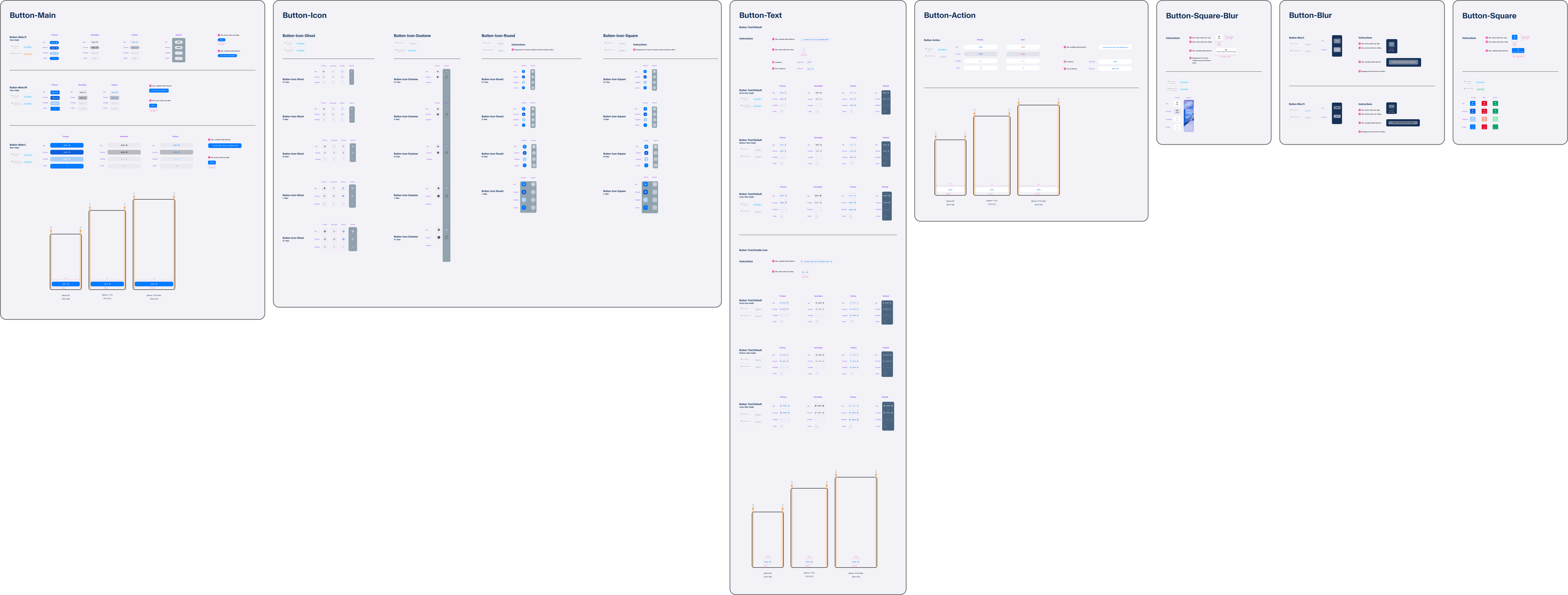
The method of working in Figma was new to the development teams, due to the fact they were used to work with Zeplin. A lot of education and syncs were needed in order to make it the transitions go smoothly. We wanted to take the design system a step forward, and to create a centralized environment where designers would deliver components to the dev teams more easily. For this purpose I built a documentation file that guides all the definitions and instructions for building each and every component in the design system.
The transition to the new design system and Figma at One Zero was very successful and received a lot of compliments, saved money that was dispersed in some old fashioned softwares, and significantly streamlined the design, product and dev processes.
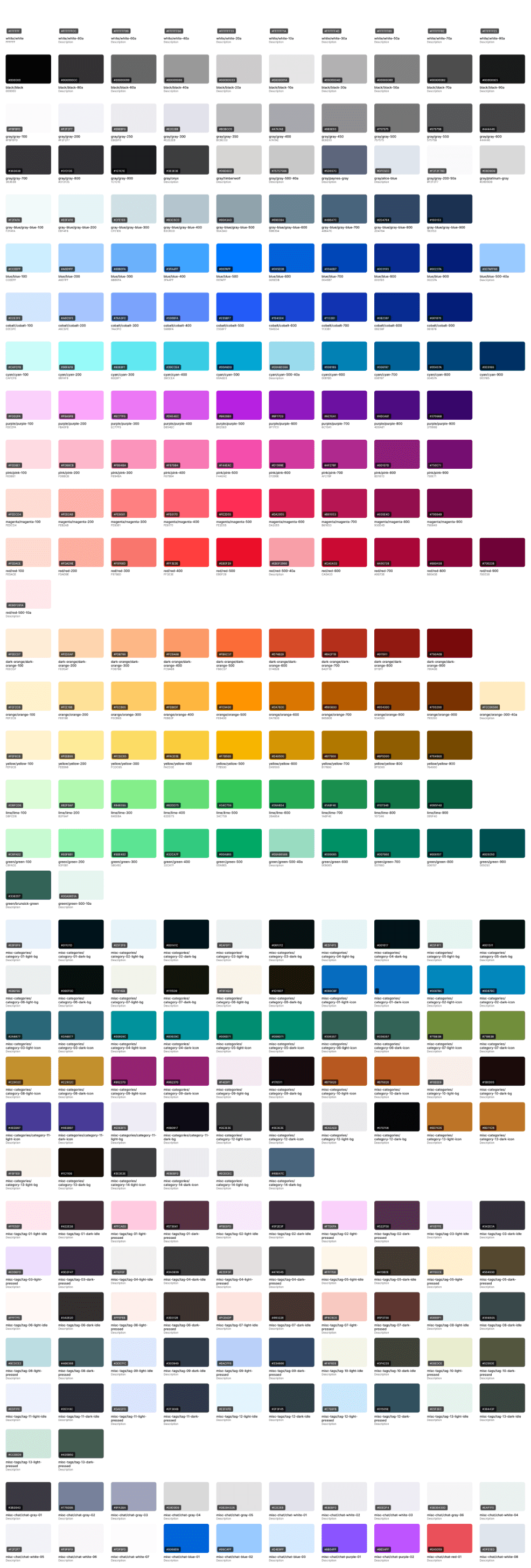


06 Colors - One Zero DS
06 Colors - One Zero DS
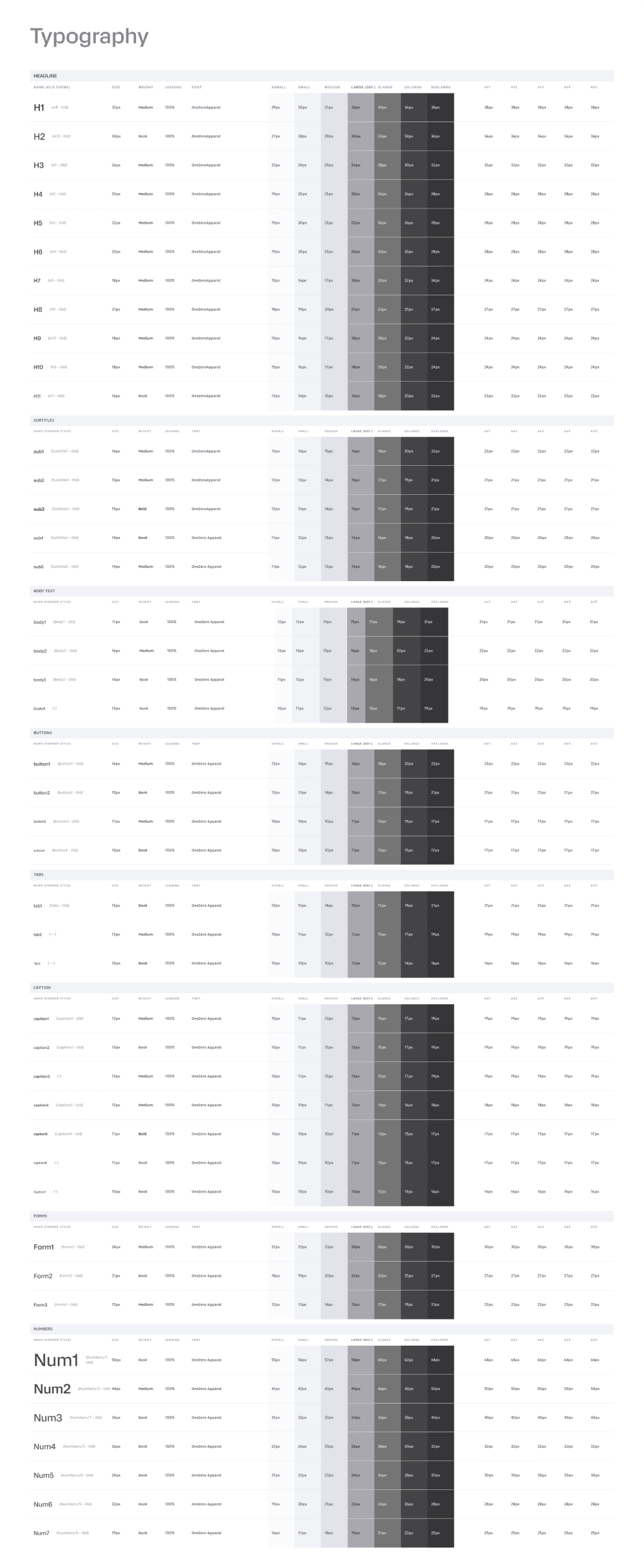


07 Typography - One Zero DS
07 Typography - One Zero DS
Buttons
Cards
Inputs
Lists
Snackbar
Categories
Tags
08 Components - One Zero DS
Conclusion
Working on design systems at Via and One Zero was really rewarding. Both projects improved work process and helped the teams work more efficiently. It showed me how important a good design system is for making great digital products.
Conclusion
Working on design systems at Via and One Zero was really rewarding. Both projects improved work process and helped the teams work more efficiently. It showed me how important a good design system is for making great digital products.
Building Design Systems
My Key Takeaways
Balancing Flexibility and Consistency
I found that great design systems flex without compromising. They maintain brand identity while adjusting to each product's unique needs.
Developers Are Your Best Friends
Teaming up closely with dev groups wasn't just helpful - it was game-changing. We built a shared vocabulary that cut through the noise and boosted our teamwork.
Living Documentation
Gone are the days of static guidebooks. I learned that keeping our docs current and comprehensive was crucial for long-term success and getting new team members up to speed.
Smart Component Structure Pays Off
By organizing our components strategically, we accelerated both design and dev work. Plus, it kept everything looking sharp across the board.
