Groups
Groups is a social-dating app designed to enable friends to connect in groups, meet new people, and share content within the app's social platform.
Year
2021
Tools
Sketch, Figma
Team
Ridin' Solo
Groups
Groups is a social-dating app designed to enable friends to connect in groups, meet new people, and share content within the app's social platform.
Year
2021
Tools
Sketch, Figma
Team
Ridin' Solo

Groups
Groups is a social-dating app designed to enable friends to connect in groups, meet new people, and share content within the app's social platform.
Year
2021
Tools
Sketch, Figma
Team
Ridin' Solo

The Problem & The Solution
Amidst the challenges posed by the coronavirus pandemic in 2021, maintaining social connections became increasingly difficult. With restrictions on gatherings and social distancing measures, people faced isolation and loneliness.
Recognizing this, I created "Groups" to provide a platform for meaningful social interactions. It offers a space where friends can connect, plan activities, and share moments virtually or in person, thereby improving overall well-being.
Research
Competitive Analysis
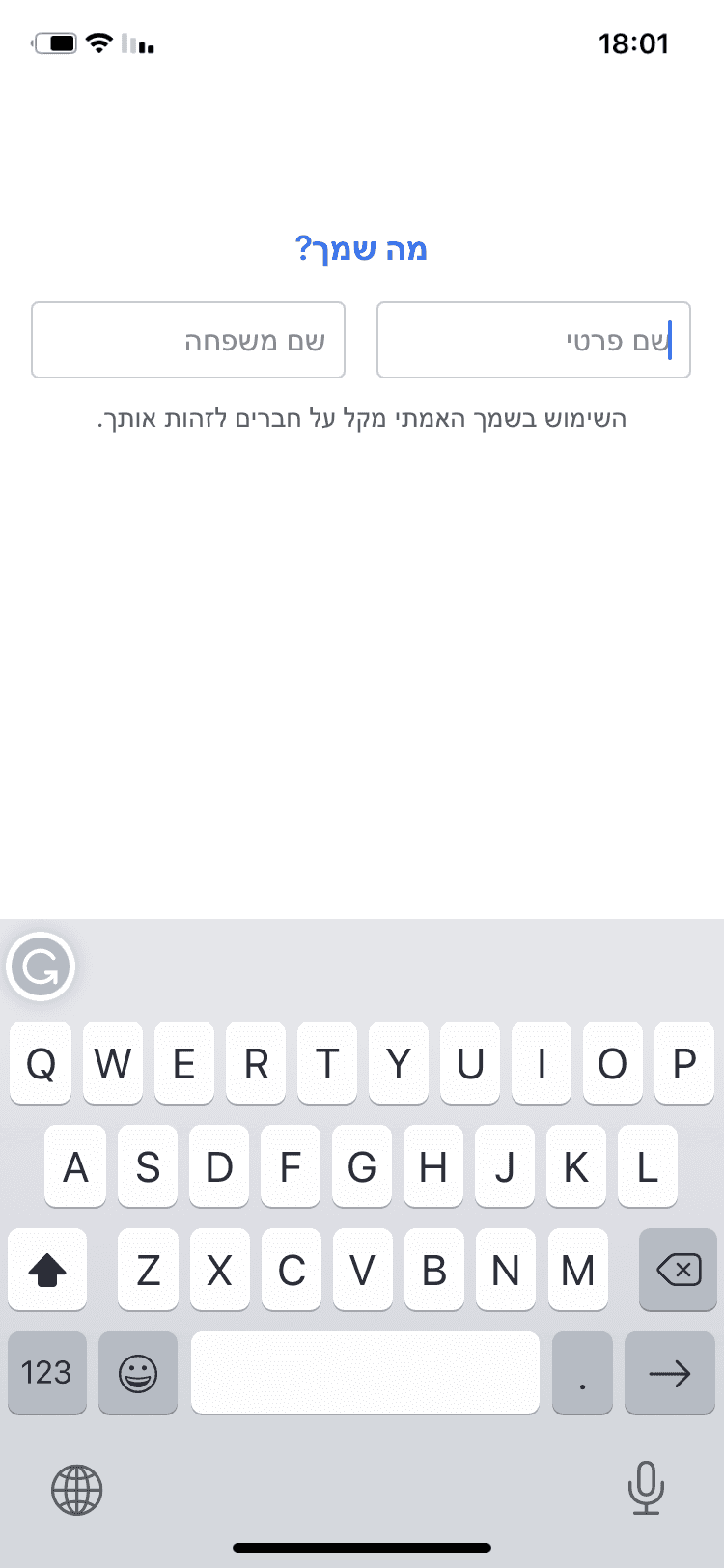
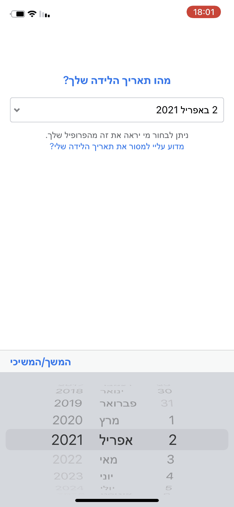
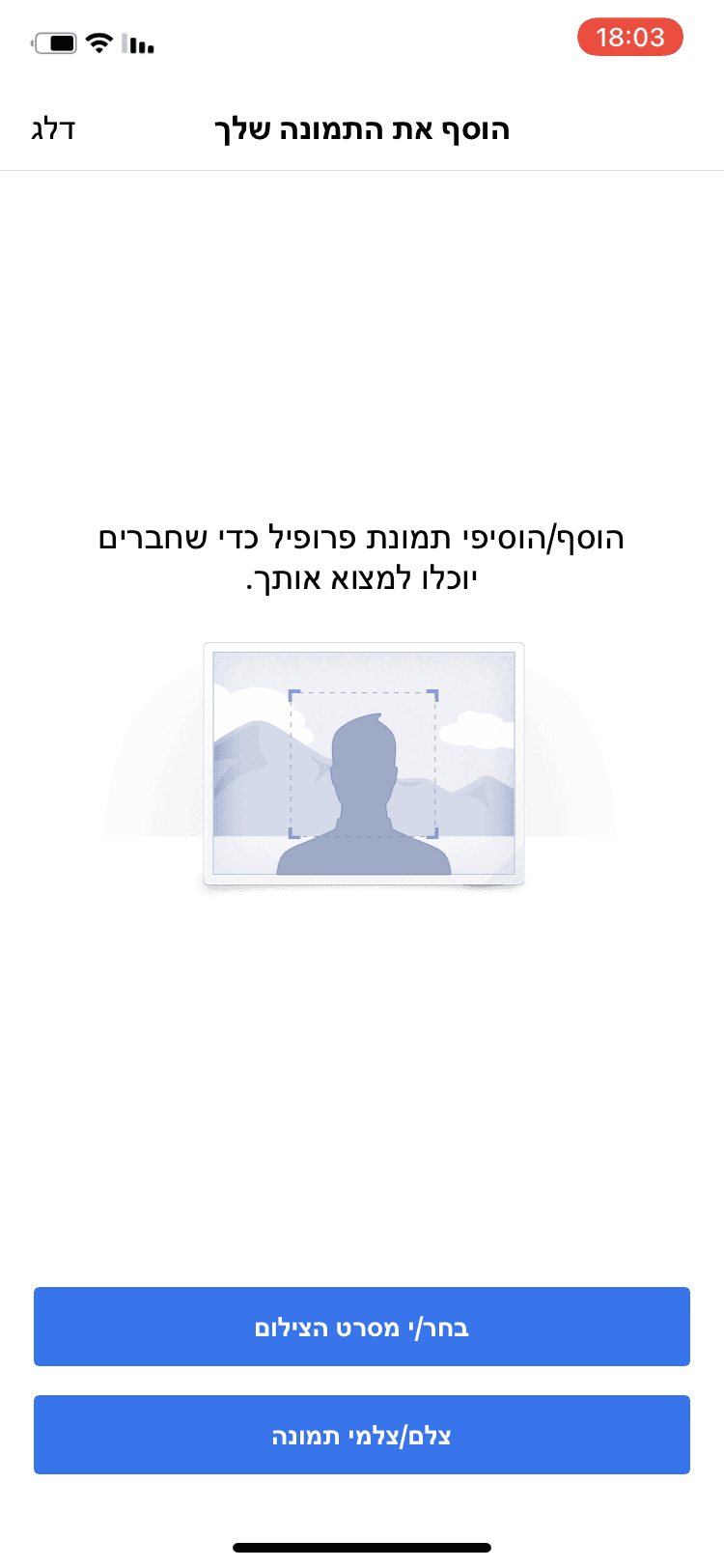
To infuse a playful connection process, I studied popular dating apps like Tinder, OkCupid, and Bumble, as well as social media platforms like Facebook and Instagram.
The goal was to merge dating and social elements into one app. Drawing inspiration from these apps, I aimed to add unique features to "Groups".
Sign Up Process
Sign Up Process
Examining the onboarding processes of various apps, I observed a detailed step-by-step approach to profile creation. I found breaking down information into separate screens beneficial for user focus. However, I noticed a lack of progress indicators, which I believe are essential for longer onboarding processes.
Examining the onboarding processes of various apps, I observed a detailed step-by-step approach to profile creation. I found breaking down information into separate screens beneficial for user focus. However, I noticed a lack of progress indicators, which I believe are essential for longer onboarding processes.


Tinder

Okcupid

Bumble


Tinder

Okcupid

Bumble


Tinder

Okcupid

Bumble


0.1 Market research - sign up process
Persons Detailing
Persons Detailing
Inspired by dating apps, I aimed to incorporate a playful approach to meeting and matching people within "Groups".
Inspired by dating apps, I aimed to incorporate a playful approach to meeting and matching people within "Groups".
Points of Difference
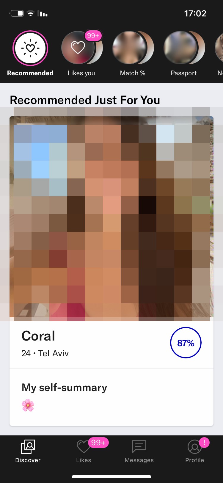
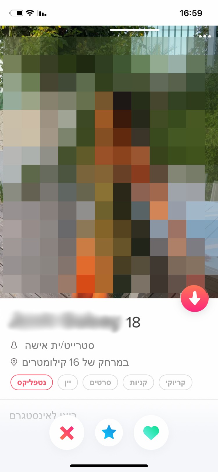
Cards View
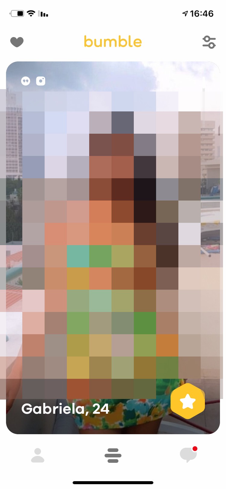
Different dating apps present people's cards in horizontal or vertical scrolling formats, each with its unique style.
Card Details
I observed variations in the presentation of user details on matching cards across dating apps, with focus on main images and additional information revealed through scrolling.
Points of Similarity
Swipes
The swipe gesture for choosing between matches emerged as a common and intuitive interaction across dating apps.
0.2 Cards exploration


Exploration
Posts
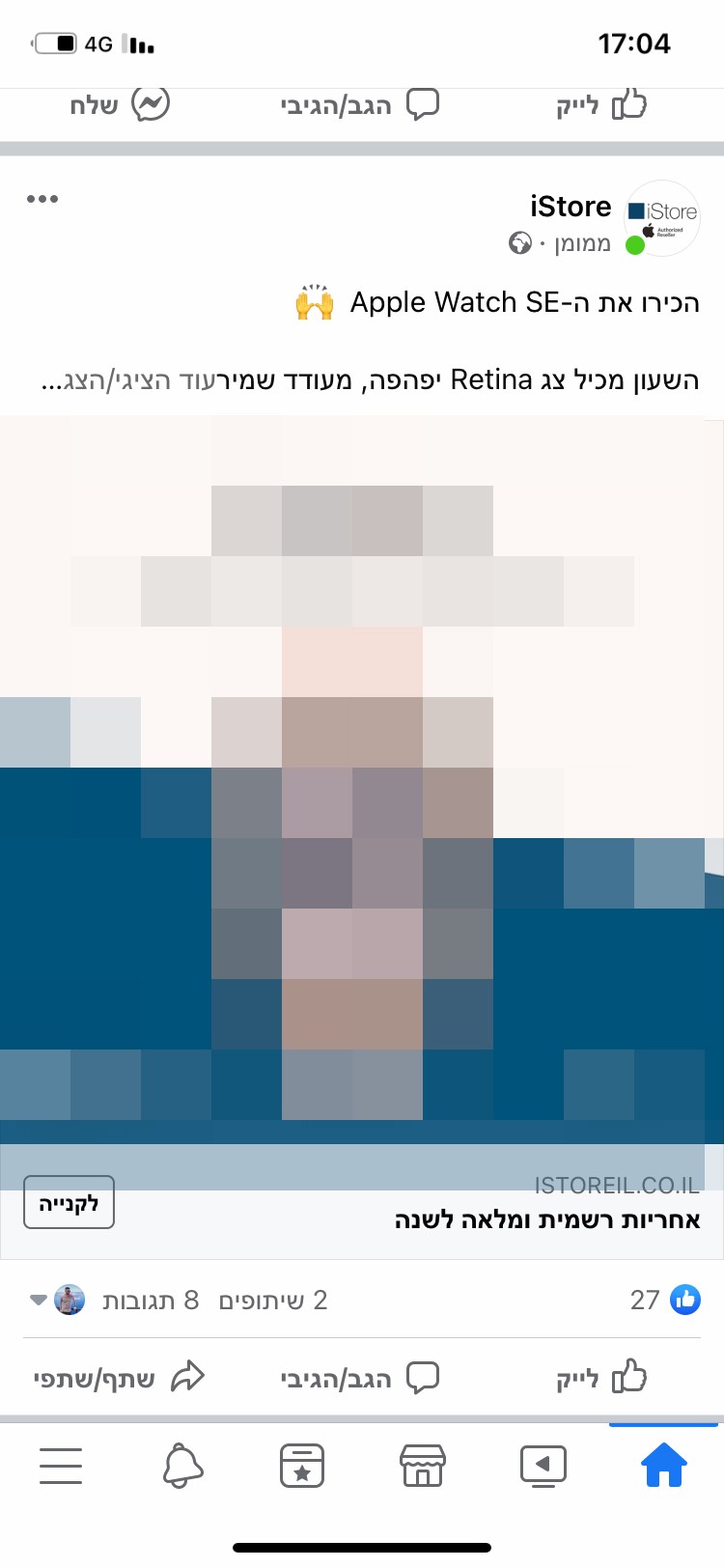
Considering the significance of posts in social media, I aimed to integrate social sharing features within "Groups".

Exploration
Posts
Considering the significance of posts in social media, I aimed to integrate social sharing features within "Groups".


Exploration
Posts
Considering the significance of posts in social media, I aimed to integrate social sharing features within "Groups".


Exploration
Posts
Considering the significance of posts in social media, I aimed to integrate social sharing features within "Groups".


Exploration
Stories
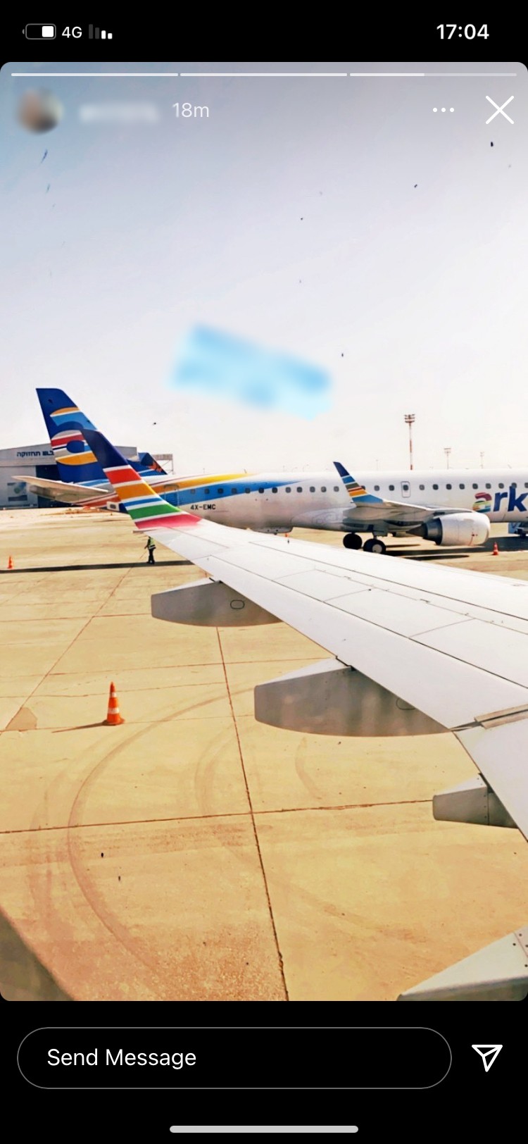
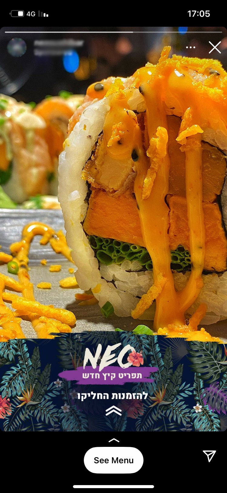
Given the popularity of stories in social media apps, I decided to include this feature in "Groups" to enhance user engagement and connection.
Exploration
Stories
Given the popularity of stories in social media apps, I decided to include this feature in "Groups" to enhance user engagement and connection.


Exploration
Stories
Given the popularity of stories in social media apps, I decided to include this feature in "Groups" to enhance user engagement and connection.


Exploration
Stories
Given the popularity of stories in social media apps, I decided to include this feature in "Groups" to enhance user engagement and connection.


Exploration
Chat
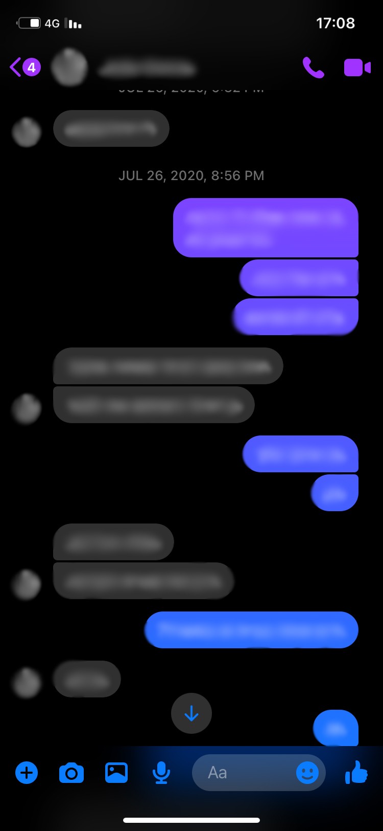
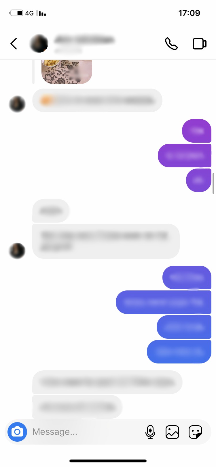
Chat functionality is essential for communication within the app. While dating apps usually facilitate one-on-one chats, social media apps allow multi-participant conversations.
Exploration
Chat
Chat functionality is essential for communication within the app. While dating apps usually facilitate one-on-one chats, social media apps allow multi-participant conversations.


Exploration
Chat
Chat functionality is essential for communication within the app. While dating apps usually facilitate one-on-one chats, social media apps allow multi-participant conversations.


Exploration
Chat
Chat functionality is essential for communication within the app. While dating apps usually facilitate one-on-one chats, social media apps allow multi-participant conversations.


Empathize
Persona

Name
Dan
Age
21 years old
Job Title
Waiter
Relationship Status
Single
Location
New York, US
Background
Dan is a nice person who hangs out mostly with his three best friends. Unfortunately, they are guys who have a hard time making new friends and they are interested in expanding their circle of friends.
The guys have several hobbies in common - they love parties, they like spending time outdoors and enjoying nature, and they like to create music together. Dan is single and has some of the most popular dating and social apps, however, he isn’t too active in any of them.
Frustrations:
• When he tries to meet a new person online he feels uncomfortable, as it seems strange to him to turn to people only for acquaintance and not for dating.
• He and his friends are failing to meet new people with similar hobbies.
• He has no motivation to upload content to social media because he doesn’t gain any added value from it.
Goals:
• Interested in having an app that would focus more on the interaction between groups rather than individuals.
• Find dating apps that place hobbies as a major aspect in connecting with other individuals.
• Interested in some sort of weekly content upload challenges, which would make him upload more content.
Empathize
Persona

Name
Dan
Age
21 years old
Job Title
Waiter
Relationship Status
Single
Location
New York, US
Background
Dan is a nice person who hangs out mostly with his three best friends. Unfortunately, they are guys who have a hard time making new friends and they are interested in expanding their circle of friends.
The guys have several hobbies in common - they love parties, they like spending time outdoors and enjoying nature, and they like to create music together. Dan is single and has some of the most popular dating and social apps, however, he isn’t too active in any of them.
Frustrations:
• When he tries to meet a new person online he feels uncomfortable, as it seems strange to him to turn to people only for acquaintance and not for dating.
• He and his friends are failing to meet new people with similar hobbies.
• He has no motivation to upload content to social media because he doesn’t gain any added value from it.
Goals:
• Interested in having an app that would focus more on the interaction between groups rather than individuals.
• Find dating apps that place hobbies as a major aspect in connecting with other individuals.
• Interested in some sort of weekly content upload challenges, which would make him upload more content.
Empathize
Persona

Name
Dan
Age
21 years old
Job Title
Waiter
Relationship Status
Single
Location
New York, US
Background
Dan is a nice person who hangs out mostly with his three best friends. Unfortunately, they are guys who have a hard time making new friends and they are interested in expanding their circle of friends.
The guys have several hobbies in common - they love parties, they like spending time outdoors and enjoying nature, and they like to create music together. Dan is single and has some of the most popular dating and social apps, however, he isn’t too active in any of them.
Frustrations:
• When he tries to meet a new person online he feels uncomfortable, as it seems strange to him to turn to people only for acquaintance and not for dating.
• He and his friends are failing to meet new people with similar hobbies.
• He has no motivation to upload content to social media because he doesn’t gain any added value from it.
Goals:
• Interested in having an app that would focus more on the interaction between groups rather than individuals.
• Find dating apps that place hobbies as a major aspect in connecting with other individuals.
• Interested in some sort of weekly content upload challenges, which would make him upload more content.
Empathize
Persona

Name
Dan
Age
21 years old
Job Title
Waiter
Relationship Status
Single
Location
New York, US
Background
Dan is a nice person who hangs out mostly with his three best friends. Unfortunately, they are guys who have a hard time making new friends and they are interested in expanding their circle of friends.
The guys have several hobbies in common - they love parties, they like spending time outdoors and enjoying nature, and they like to create music together. Dan is single and has some of the most popular dating and social apps, however, he isn’t too active in any of them.
Frustrations:
• When he tries to meet a new person online he feels uncomfortable, as it seems strange to him to turn to people only for acquaintance and not for dating.
• He and his friends are failing to meet new people with similar hobbies.
• He has no motivation to upload content to social media because he doesn’t gain any added value from it.
Goals:
• Interested in having an app that would focus more on the interaction between groups rather than individuals.
• Find dating apps that place hobbies as a major aspect in connecting with other individuals.
• Interested in some sort of weekly content upload challenges, which would make him upload more content.
Information Architecture
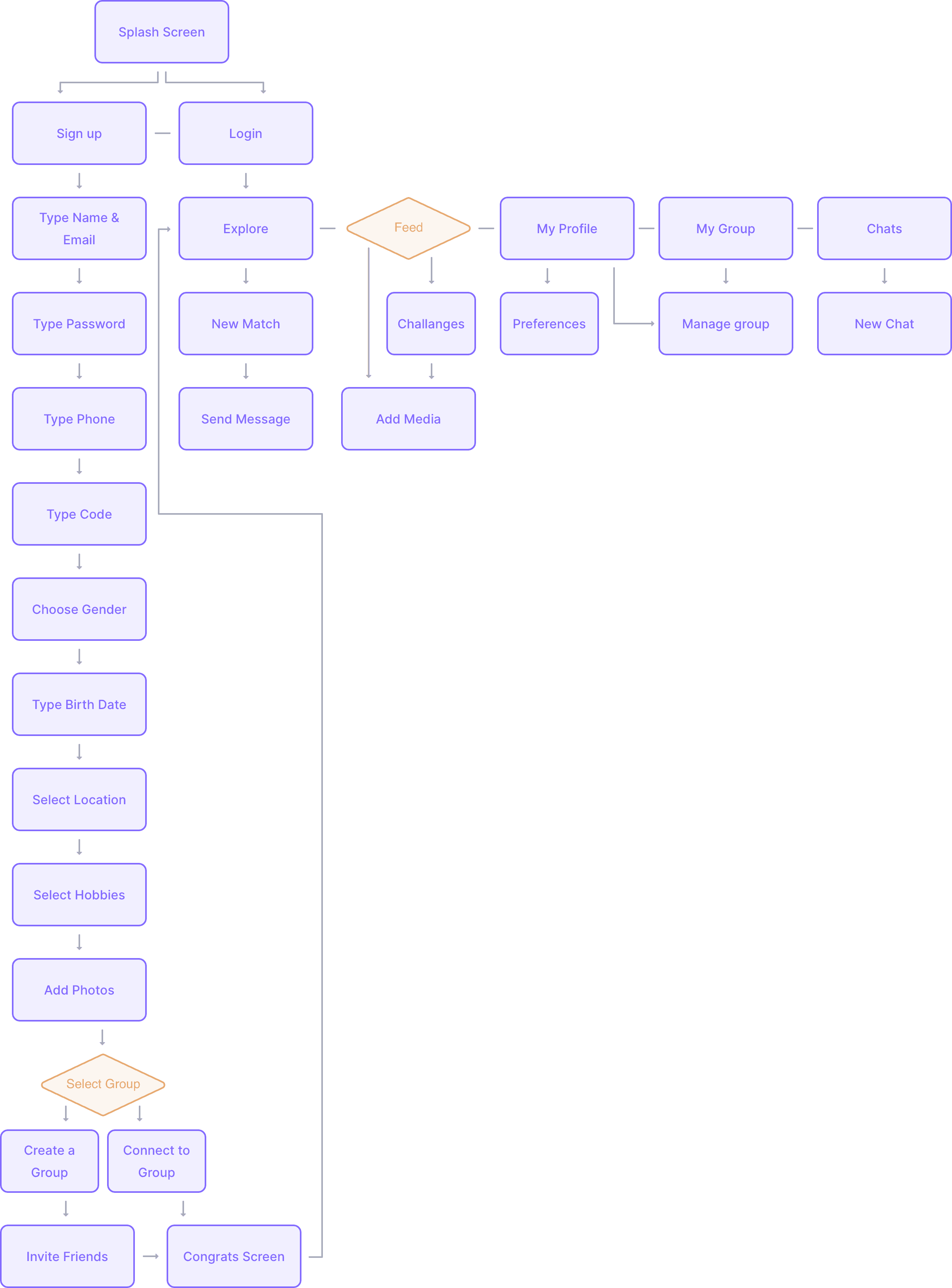
After getting to know my main competitors well enough, I decided to move on and build a short information architecture to the app.
Information Architecture
After getting to know my main competitors well enough, I decided to move on and build a short information architecture to the app.

0.3 Information architecture
0.3 Information architecture
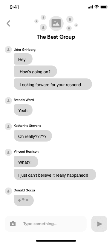
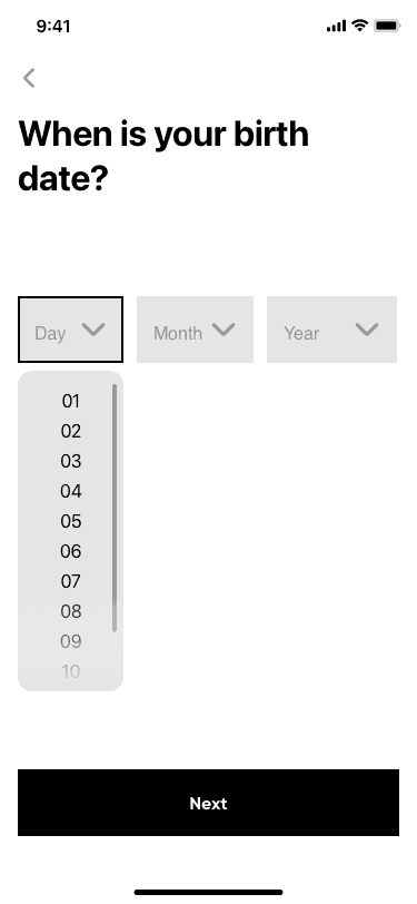
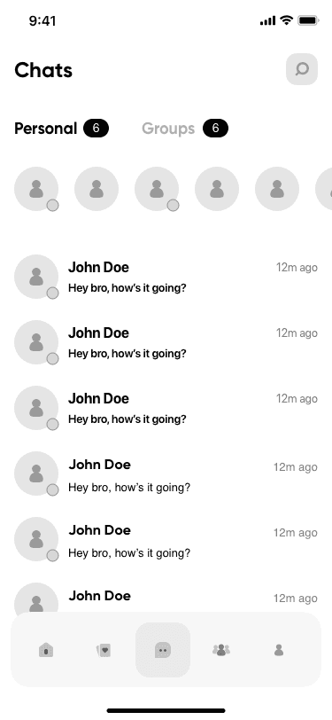
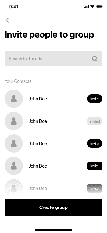
Wireframing
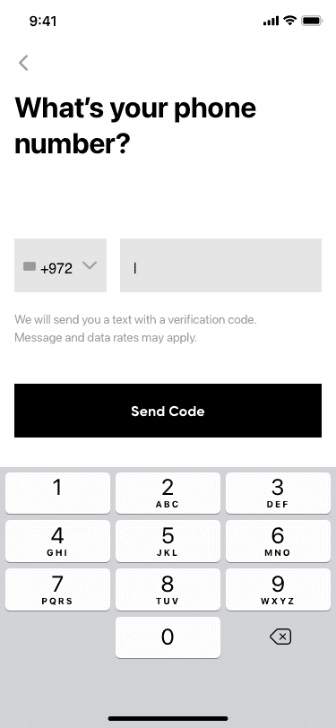
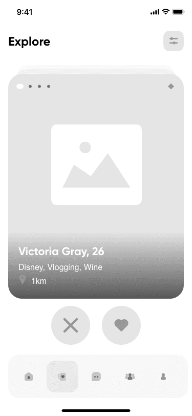
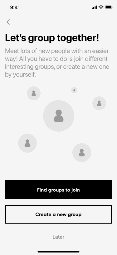
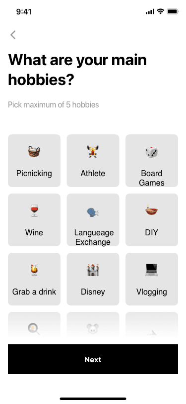
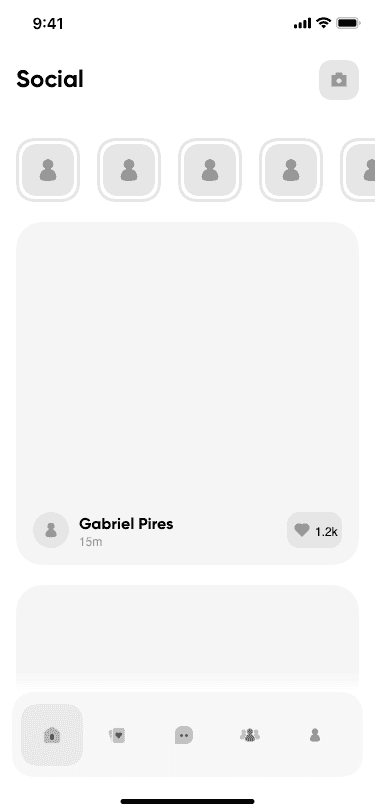
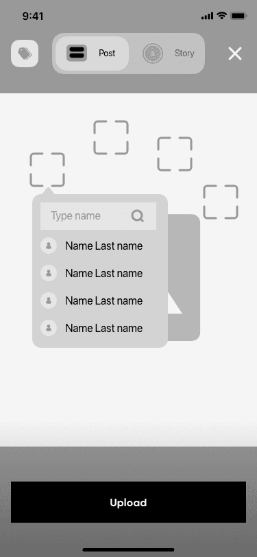
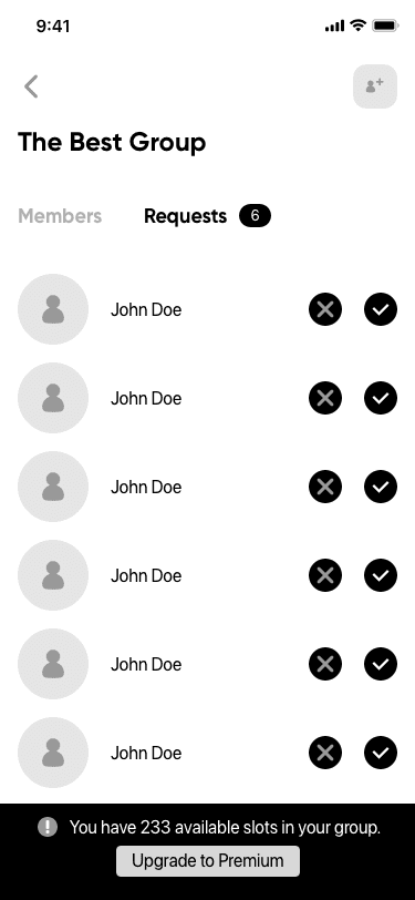
Low-fidelity mock-ups were created to validate functionality before moving to detailed UI design.
Wireframing
Low-fidelity mock-ups were created to validate functionality before moving to detailed UI design.






















0.4 Wireframes
0.4 Wireframes
UI Design
The UI design process focused on key features of the app, ensuring a cohesive and user-friendly interface.
UI Design
The UI design process focused on key features of the app, ensuring a cohesive and user-friendly interface.
Key Feature 01
Key Feature 01
Sign Up Onboarding
Sign Up Onboarding
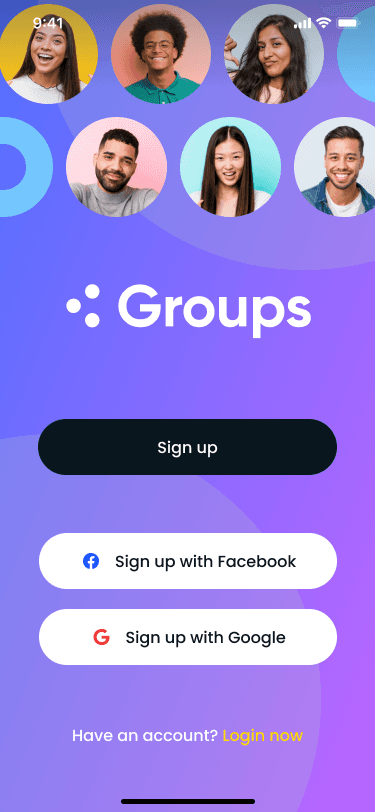
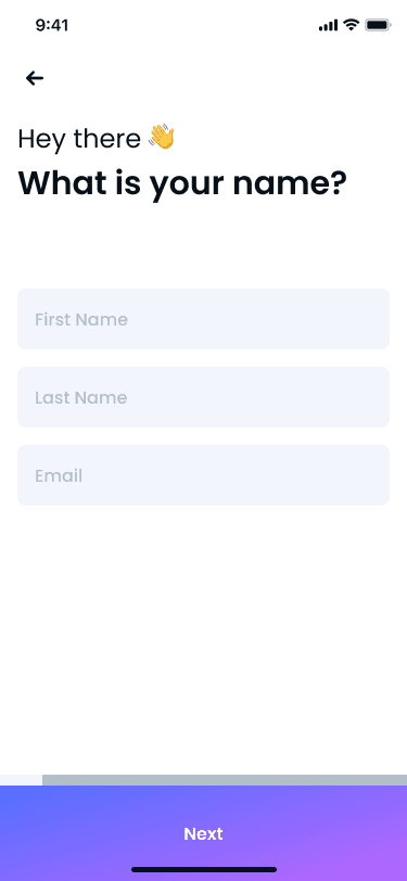
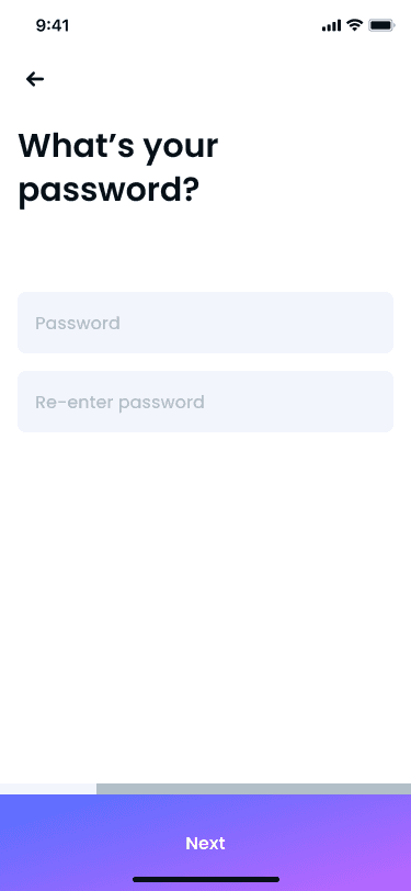
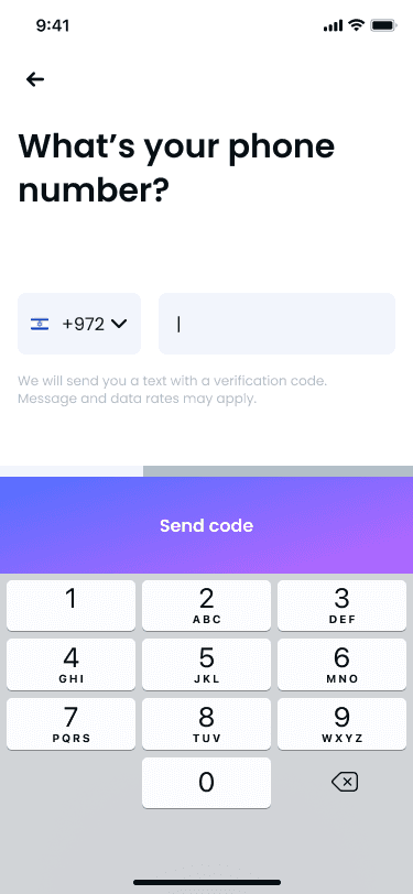
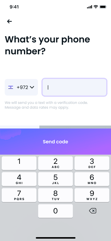
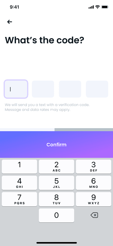
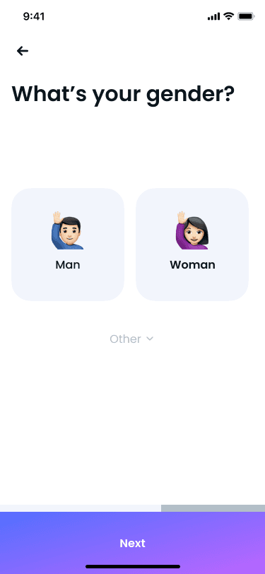
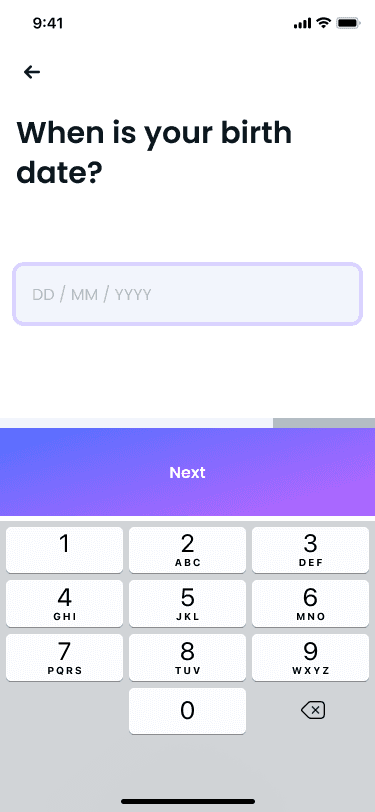
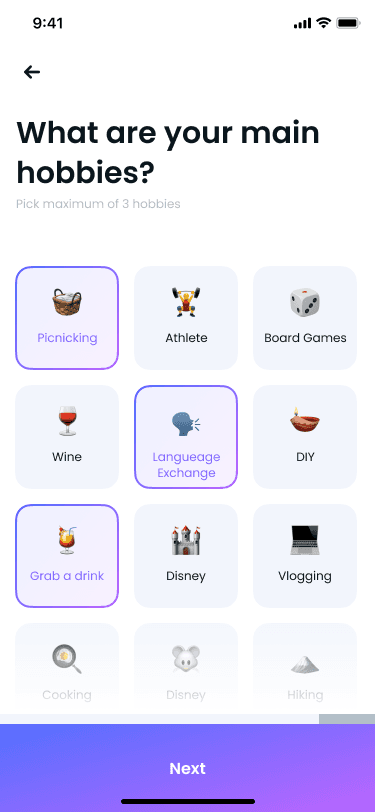
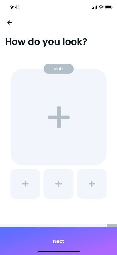
The initial screens users encounter upon launching the app. I opted to divide the registration process into separate screens and include an indication bar above the primary button to guide users through the process.
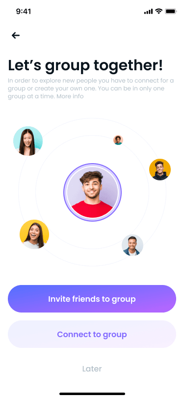
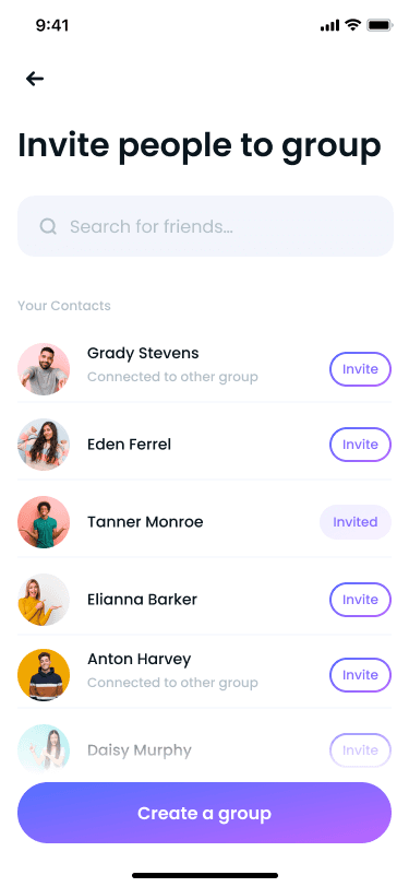
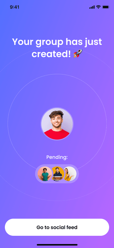
After signing up and selecting hobbies, users will be prompted to either join an existing group of friends or create a new one. The app will then request permission to access contacts synced via Facebook or mobile contacts.
Key Feature 02
Connect with Groups
This is the central screen in the app, where users can explore and connect with new people.
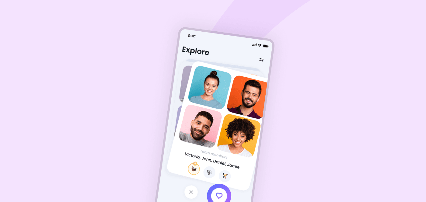
Through the explore screen, groups are presented with potential matches. Users can swipe right or left (like or dislike) on the avatars of all group members displayed on the same card. Clicking on the card reveals more information, and filters can be applied by clicking the filter button above.
When groups match, a special screen opens with an option to start a group chat.
Key Feature 03
Share Your Moments
During the media upload process, users can upload media to their personal gallery or their group's gallery.
With the tagging option, users can drag avatars of their teammates onto their faces, automatically recognizing the image as a group image.
Key Feature 03
Share Your Moments
During the media upload process, users can upload media to their personal gallery or their group's gallery.
With the tagging option, users can drag avatars of their teammates onto their faces, automatically recognizing the image as a group image.
Key Feature 03
Share Your Moments
During the media upload process, users can upload media to their personal gallery or their group's gallery.
With the tagging option, users can drag avatars of their teammates onto their faces, automatically recognizing the image as a group image.
Key Feature 04
Watch Friends' Moments
The social platform within the app allows groups to share photos and stories to their feed. Users can view and like media uploaded only by groups they have matched with.
Key Feature 04
Watch Friends' Moments
The social platform within the app allows groups to share photos and stories to their feed. Users can view and like media uploaded only by groups they have matched with.
Key Feature 04
Watch Friends' Moments
The social platform within the app allows groups to share photos and stories to their feed. Users can view and like media uploaded only by groups they have matched with.
Key Feature 05
Compete in Weekly Challenges
To incentivize groups to upload more content, I introduced the Weekly Challenges feature. Each week, a new challenge is presented, offering groups the chance to win special prizes by uploading photos/videos together with all group members.
Key Feature 05
Compete in Weekly Challenges
To incentivize groups to upload more content, I introduced the Weekly Challenges feature. Each week, a new challenge is presented, offering groups the chance to win special prizes by uploading photos/videos together with all group members.
Key Feature 05
Compete in Weekly Challenges
To incentivize groups to upload more content, I introduced the Weekly Challenges feature. Each week, a new challenge is presented, offering groups the chance to win special prizes by uploading photos/videos together with all group members.
Key Feature 06
Manage Your Group Easily
There are two profiles - personal and group - accessible to all group members. These profiles are visible only to people who have matched before.
On the group profile, users can view group members, their common hobbies, a shortcut to group chat, and the group's photo gallery. Additionally, a feature allows team members to share their planned outings, attracting matches to join.
Only the group manager has the authority to remove friends from the group, invite friends to join, delete the group, and more.
Key Feature 07
Chat with Multiple People
This screen enables users to chat with other groups they have matched with. Matches not yet engaged in conversation are displayed at the top, followed by conversations between group members.
New match notifications prompt suggested opening messages to encourage conversation.
Users can also attach media to conversations, enhancing the interaction and encouraging users to stay within the app.
Styleguide
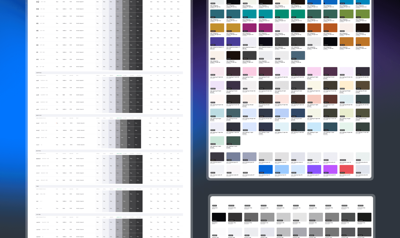
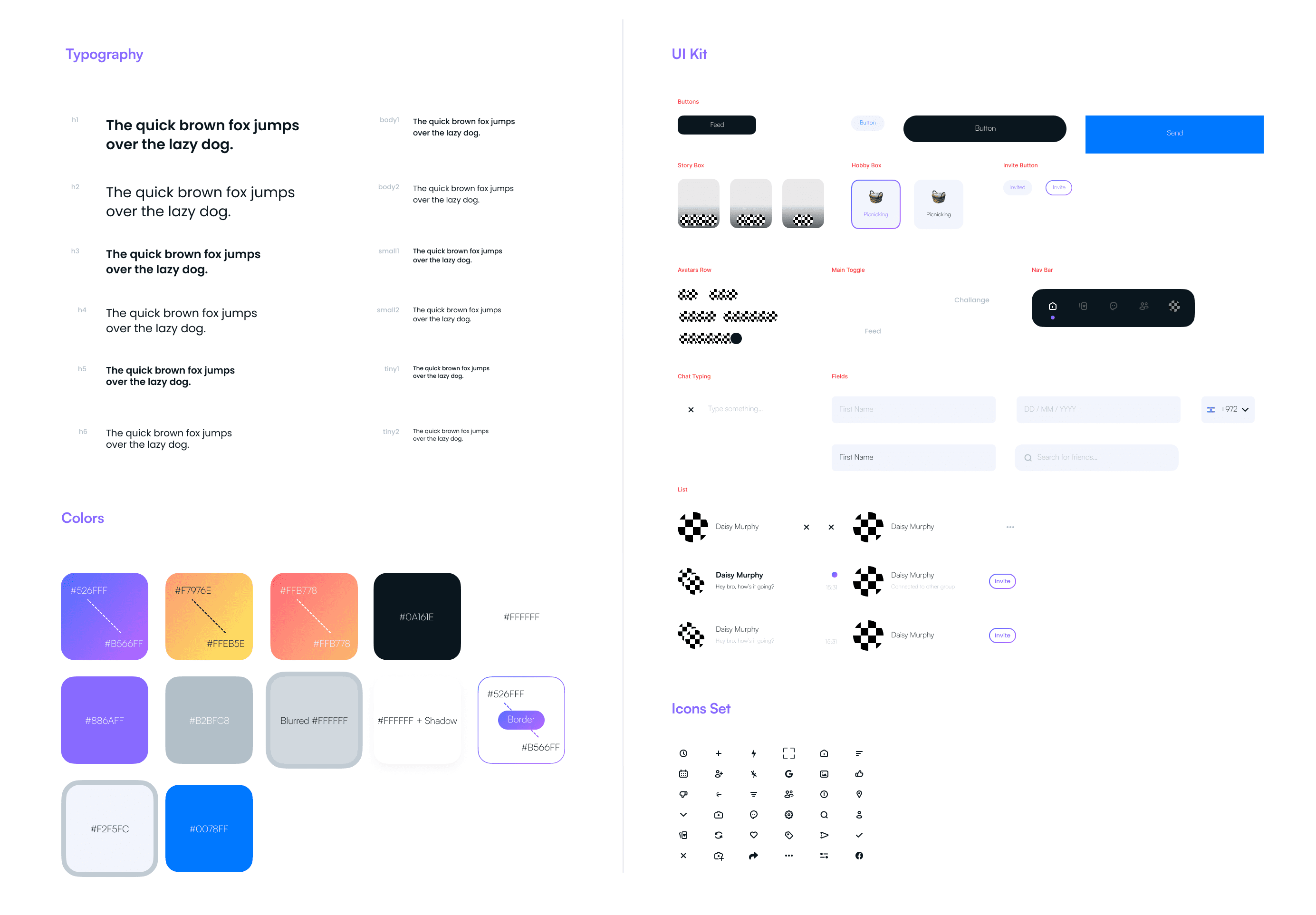
In order to make the application design process easier and more orderly, I built a styleguide that will combine all the colors, styles and fonts. In addition, I created a UI Kit in order to keep all the components in one place so I can access and edit each one of them more easily.
Styleguide
In order to make the application design process easier and more orderly, I built a styleguide that will combine all the colors, styles and fonts. In addition, I created a UI Kit in order to keep all the components in one place so I can access and edit each one of them more easily.

0.6 Styleguide
0.6 Styleguide


